Punchdrunk’s The Masque of The Red Death at Battersea Arts Centre.
Alice Saville on The Masque of the Red Death and The Good Neighbour:
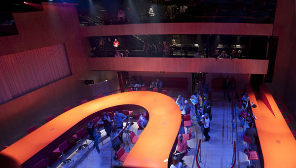
Years ago in 2007, I went to the Battersea Arts Centre to see Punchdrunk’s Masque of the Red Death, utterly unprepared for the crafted hyper-reality that hit me. The gothic depths and emotional heights of its Poe-themed fantasia were utterly overwhelming, cloaking the audience in a luxurious velvet-trimmed, incense-scented and absinthe-soused case for this new word “immersive”, which I’d noticed starting to creep into theatre blurbs and directors’ statements. One moment particularly stuck with me. I crawled through a fireplace, not even sure if I was accidentally breaking the performance’s ill-defined rules of engagement, to realise that someone had studded the wall inside with butterflies, arranged with exquisite care. Under them, an oil lamp to raise, to look at them more closely.
Six years later, Punchdrunk’s delicate sheen of magic had rubbed off. My faith in their emphasis on individual experience and autonomy was complicated by meeting members of their army of design student interns, the dawning realisation of how little of the shows’ stories I ever actually pieced together, and watching them spread out from the fringe’s upper reaches to a whole body of genre-dominating work in London and New York.
Interviewing designer Helen Scarlett O’Neill, I was struck when she mentioned that the first thing that Punchdrunk do to a space is block off all the windows. They’re creating a sealed world, encased by the space that acts as a flexible, pliable shell. But the approach of The Good Neighbour at the BAC, billed as “immersive” five years after Punchdrunk’s Masque, couldn’t be more different. Every word felt like it was spoken by the space that housed it. One room housed Kazuko Hohki’s installation was a womb-like beehive, also to be crawled into on awkward hands and knees. But although it cloaked the space’s angles in a hexagonal tent, unlike the show’s other rooms, it was also a re-imagination of its place on the old, still swarming flower fields of Lavender Hill. In a child-like bee costume, Kazuko was irreverent. She asked “do you like this rug? Ikea.” It felt refreshing to abandon the dim light and mystery of set dressing so thorough it dressed you up, too.
These two insect encounters feel like equally beautiful opposites. Private or communal, furtive or conversational, cold or warmly enveloping, they’re humming with contrasts that make me think about how I want to engage with designs, and the spaces that house them.
Dan Hutton on Earthquakes in London:
When I think of a great piece of design which just worked, my mind immediately skips to Miriam Buether’s work on Earthquakes in London in the Cottesloe four years ago. It was the first time I’d visited that space, and walking into the theatre to be met with a snaking bright red bar complete with swivel chairs meant that every design I’ve seen there since has paled in comparison. It was just so deliciously simple, evoking a river, blood, the passage of time and line graphs all in one whilst allowing an astonishing freedom of movement. And that’s not even considering the two ‘stages’ at either end of the space which opened and closed to reveal a plethora of new rooms to ensure the beating, rhythmic heart of Mike Bartlett’s play never lost its searing urgency. In Buether’s set, the show didn’t just happen; it happened to you, around you and within you. It was garish, it was loud, it was bright. And my God it was sexy.
Earthquakes in London
Diana Damian on Vortex Temporum:
Perhaps it was encountering Anne Teresa De Keersmaeker’s work outside of the UK, at the Royal Opera House in Amsterdam, that has made this encounter with scenography particularly striking. The bare stage of the auditorium was lit only by a series of fluorescent lights concentrated around particular areas; thus the geometric patterns inscribed onto the floor – series of overlapping circles – seemed to be merely traces, notations of movement passed. The movement responds to and interacts with Gerard Grisey’s music in a dynamic, highly choreographed and precisely notated process of time distortion. The musicians and performers create rhythms of fragmented movement that makes time perceivable; lost in the darkness of the stage, wearing all blacks, these bodies become part of a routine of musical scenography, playing with gravity, mobility and the language of geometric configurations. This is a performance that engages with rotation as a durational, aesthetic process: constructing a microcosm of power relations, slipping metaphors and engaging visual poetry.
Catherine Love on Desire under the Elms:
As a production, I can’t say that the Lyric Hammersmith’s revival of Eugene O’Neill’s Desire Under the Elms thrilled me. O’Neill is one of those playwrights I just struggle to get on with, for reasons I still haven’t quite pinned down, and I found the evening a little laboured on the whole. But the key to this version of the play for me, and what managed to keep me interested despite my reservations, was Ian MacNeil’s visually eloquent design. Just as his revolving set for the Young Vic’s A Doll’s House managed to put an elegant spin – both literal and metaphorical – on what initially looked like straightforward naturalism, here a simple concept opened out into multiple, nuanced readings.
On the most basic of levels, MacNeil created a house that came to pieces, allowing individual scenes to be staged in a series of self-contained, claustrophobic domestic spaces. But what these fragile rooms spoke of was the futility of the characters’ tragic obsession with property – an all too flimsy and fleeting aspiration – and the alienation that such obsession breeds. At the same time, the stage was often gorgeous to look at, operating on both eyes and intellect. It was, for me, one of the most captivating examples of how a brilliant design concept can totally transform the experience of watching an otherwise unremarkable show.
William Drew on Romeo Castelluci’s Inferno:
When you asked this, I sort of immediately discounted Romeo Castelluci, as if he wasn’t allowed to compete. I think that goes to show that, for me at least, there’s nobody quite like him when it comes to treating the stage like an artist’s canvas. So it was his Inferno, specifically the beginning. I saw it at the Barbican but I think it had opened in Avignon. There’s a flickering neon light that provides a constant irritant to the social experience of taking your seat in the theatre, so you’ve already got this thing going on which is working against the other elements of going to see a play: the artist is trying to make you feel physically uncomfortable from the start. Lights go off. A bunch of dog handlers come on stage with some German shepherds. They’re police dogs. Some are on leads but others are chained up so they’re barking like crazy. Then lights on a man centre stage in full body armour except on his head. He says: “My name is Romeo Castelluci” and the dogs go for him. It looks like they’re going to kill him and as they’re attacking, there’s the deafening barking of all the other dogs. If there’s the theatre equivalent of a rock star: it’s him.